Haven & Co. — Real Estate Branding & Visual Identity
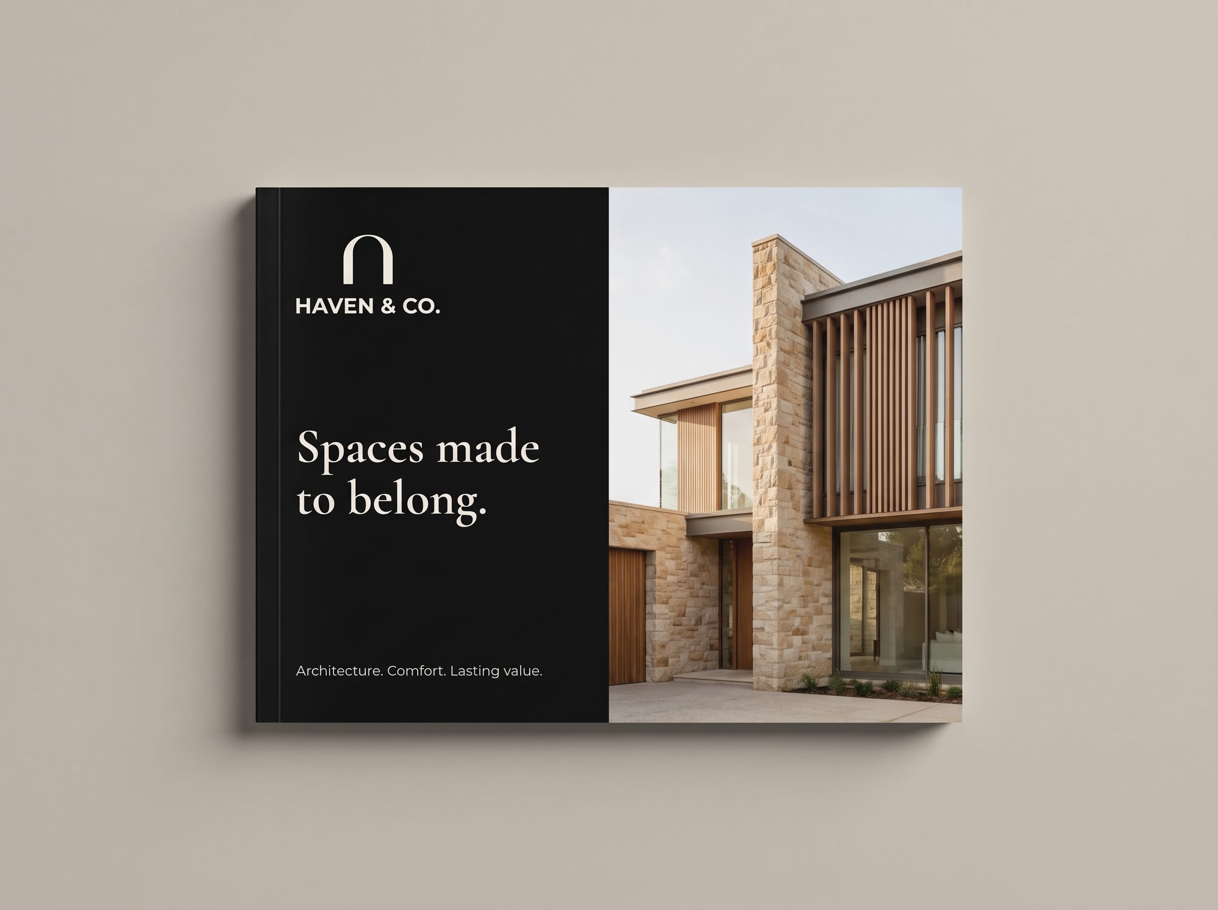
A complete real estate brand identity for Haven & Co., combining an architectural arch logo, editorial typography, and a warm neutral palette. The visual system extends across stationery, property brochures, signage, social media, and digital design concepts.

01 — Context
Haven & Co. is a real estate branding concept built around the idea of belonging. The visual direction brings together modern architecture, everyday comfort, and a calm approach to property marketing.

02 — Challenge
The challenge was to create a distinctive real estate identity that felt confident and welcoming. The design needed to work across small stationery items, large exterior signage, and digital marketing without losing its clarity.
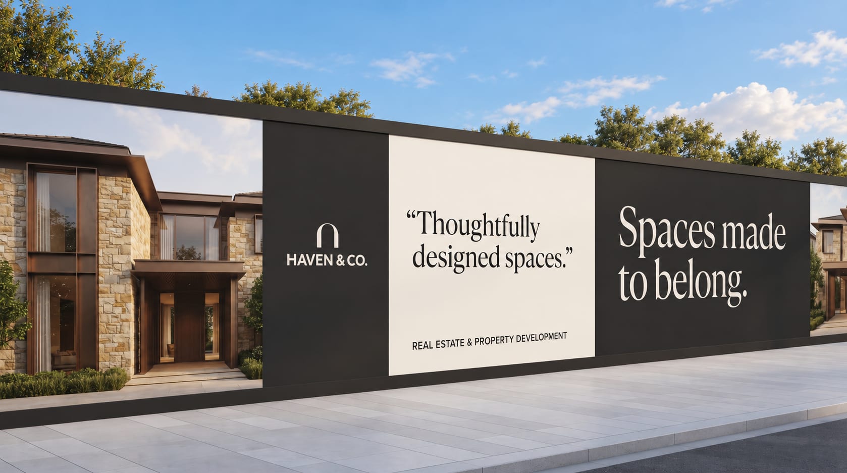
“Spaces made to belong.”
03 — Approach
An architectural arch became the central brand symbol, expressing shelter, openness, and arrival. Bold logo typography was paired with editorial serif headlines, clean supporting text, and a warm neutral palette. Generous spacing and carefully selected architectural imagery connected the applications.

Typography
Cormorant Garamond
- Designer
- Christian Thalmann
- Weights
- Regular, Medium
- Use
- Editorial headlines, brand statements, and campaign titles. Creates a refined architectural character with generous spacing and expressive scale.
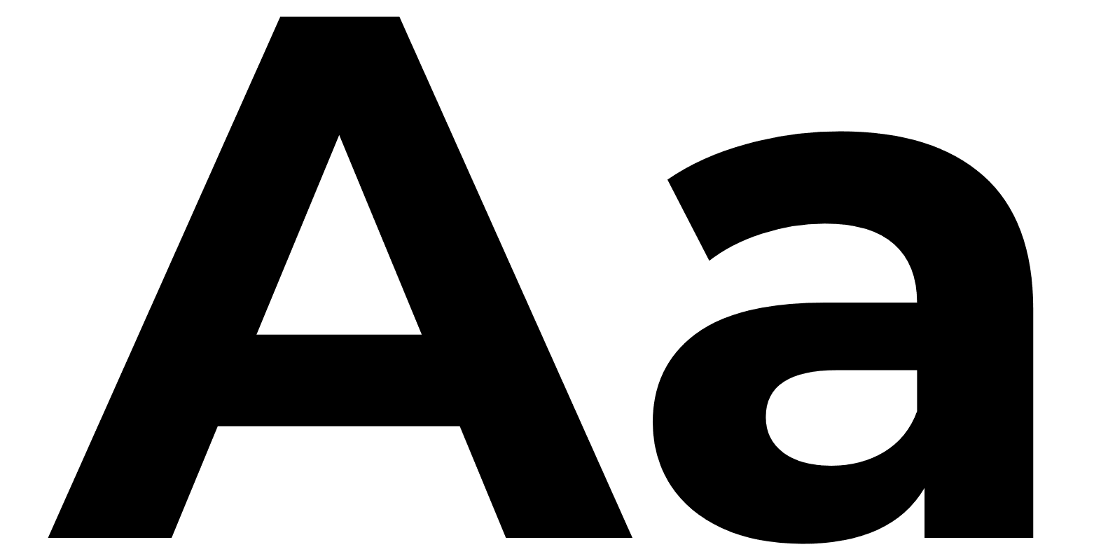
Typography
Montserrat
- Designer
- Julieta Ulanovsky, Sol Matas, Juan Pablo del Peral, Jacques Le Bailly
- Weights
- Regular, Medium
- Use
- Body copy, navigation, captions, and property information. Keeps communication clear and consistent across print and digital applications.




04 — Outcome
The project developed into a coordinated visual identity presented through 26 application slides, covering logo variations, stationery, property collateral, signage, digital interfaces, and marketing concepts.
Have a project in mind?